Simple Linear Models
This post focuses on how to write a simple linear model.
Quick note about statistics
Today we are going to talk about how to code a simple linear model. Now that we are getting into some basic statistics, I want to make a point that this blog is focused on coding, not statistical theory. I am not going to spend much time discussing when or why to use different statistical tests, but will instead refer you to some of my favorite texts on the subject. Please, please, please, make sure that you understand your data and that it meets all the required assumptions of the different tests that we will run today and into the future.
Linear Models
Today, we are going to use Piper’s mussel and barnacle data again and build off our code from week three (click here for a reminder). You will recall that we calculated various summary statistics for her tide height data (means, minimum, and maximum values) across her different sites and regions. Today, we are going to see if there is any relationship between those values and latitude.
The basic anatomy of a linear model is very simple:
mod <- lm(y~x)
lm stands for linear model. Inside the brackets is read as y (your dependent variable) is a function of x (your independent variable) and is called a formula. Formulas are a common format for many different statistical tests in R. This code can also be used for a multiple linear regression.
mod <- lm(y ~ x1 + x2 + x3)
Here, x1, x2, and x3 are three different independent variables.
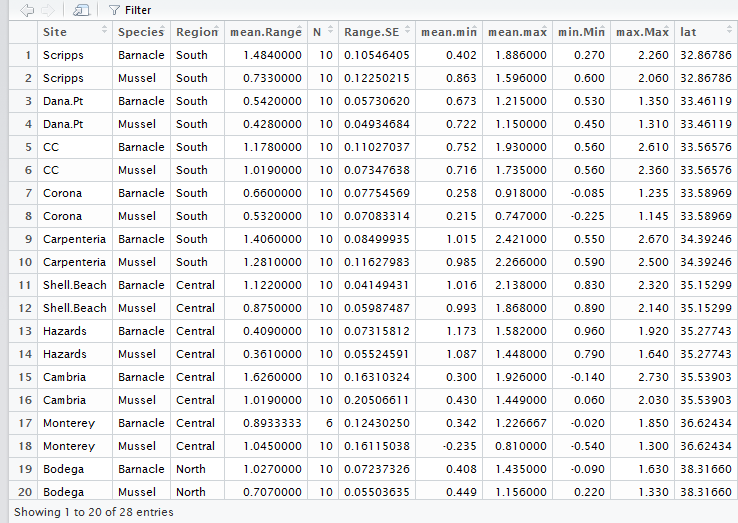
Let’s test if there is a significant linear relationship between latitude and the average vertical range of mussels and barnacles. As a reminder, here is what her summary dataframe looks like:
The most basic model would look like this:
mod<-lm(mean.Range ~ lat, data = Data.summary)
You will notice that I added some more information within the function. In addition to the formula (mean.range ~ lat), I also added data = Data.summary. This tells R what dataframe to pull the data from. This is not required, but it is the most clean way to code it. You could have also coded it like this:
mod<-lm( Data.summary$mean.Range ~ Data.summary$lat)
However, this is still not quite right for Piper’s data because she has 2 different species and we want to model them separately. To model the effect of latitude on mussel range we can add another argument called subset. This code says to just use the Mussel data in the analysis
mod<-lm(mean.Range~lat, data = Data.summary, subset= Data.summary$Species == 'Mussel')
The above code will model only mussels, but if you wanted to compare mussels and barnacles in the same model you would code it like this:
mod<-lm(mean.Range~lat*Species, data = Data.summary)
The lat*Species is testing the effect of latitude, species, and the interaction between latitude and species on mean.Range.
Testing for normality of residuals and viewing results
So, what are the major assumptions of a linear regression? Answer: linear relationship, multivariate normality, no or little multicollinearity, no auto-correlation, homoscedasticity. I think one of the most confused assumption is the one based on normality. The assumption is that your residuals follow a normal distribution, NOT that your data are normal. The quickest way to check this assumption is to look at your quantile-quantile plot. It should look like a straight line. You can also test if your residuals are normal using a Shapiro-Wilk normality test. Here is a nice post on how to interpret your qqnorm plot.
# test for normality of residuals
qqnorm(resid(mod)) #plot normal quantile- quantile plot.  Should be close to a straight line
shapiro.test(resid(mod)) # shapiro test which tests if the residuals are normal
If all your assumptions are met then we can look at the results. There are two ways to view your results:
anova(mod)
summary(mod)
The anova function displays the ANOVA table for your model and summary displays your coefficients, standard error values, and p-values for your various independent variables, r2 values and some other useful information.
Plotting your results
If we find a significant relationship, we usually want to visualize what the relationship looks like. We can use the predict function to predict new y values based on our model. With predict, we can get fitted values, standard errors, and 95% confidence intervals. Type ?predict, to see the different arguments.
#First a simple linear model for just the Mussel Data
mod<-lm(mean.Range~lat, data = Data.summary, subset= Data.summary$Species == 'Mussel')

#plot the results
#another way to plot, using a formula instead of x,y
plot(mean.Range~lat, data = Data.summary, subset= Data.summary$Species == 'Mussel')
# add a trendline
new.Y<-predict(mod, se = TRUE, interval = 'confidence') # fit, upper and lower CI
# add a best fit line
lines(Data.summary[Data.summary$Species == 'Mussel',"lat"], new.Y$fit[,1])
# add lines for 95% confidence intervals
lines(Data.summary[Data.summary$Species == 'Mussel',"lat"], new.Y$fit[,2], col = 'red')
lines(Data.summary[Data.summary$Species == 'Mussel',"lat"], new.Y$fit[,3], col = 'red')
The output will look like this:
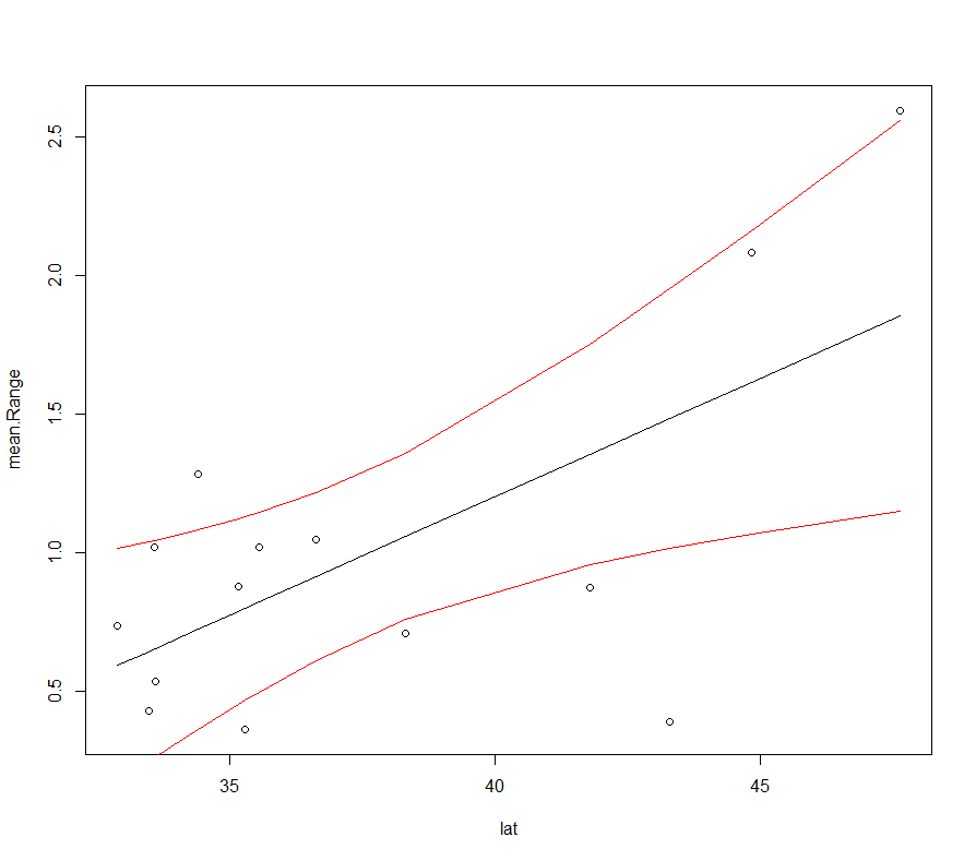
Of course, you will want to change the x and y labels to make it prettier.
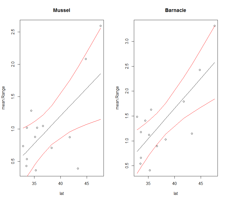
For looping over several models
Now, let’s combine our for loop skills with our new lm skills to create plots for multiple models at once. The first obvious one is to create models for both mussles and barnacles.
First, we need to make a variable for the unique species to loop over.
sp<-unique(Data$Species)
Now, let’s put it in a for loop:
par(mfrow=c(1,2)) # make two subplots
for (i in 1:length(sp)){
  # create a model
  mod<-lm(mean.Range~lat, data = Data.summary, subset= Data.summary$Species == sp[i])
  # plot the raw data
  plot(mean.Range~lat, data = Data.summary, subset= Data.summary$Species == sp[i], main= sp[i])
# add a trendline
new.Y<-predict(mod, se = TRUE, interval = 'confidence') # fit, upper and lower CI
lines(Data.summary[Data.summary$Species == sp[i],"lat"], new.Y$fit[,1])
# add lines for 95% confidence intervals
lines(Data.summary[Data.summary$Species == sp[i],"lat"], new.Y$fit[,2], col = 'red')
lines(Data.summary[Data.summary$Species == sp[i],"lat"], new.Y$fit[,3], col = 'red')
print(sp[i]) # display the species name
print(anova(mod)) # display the results of the model
}
This code will automatically create the following plot:
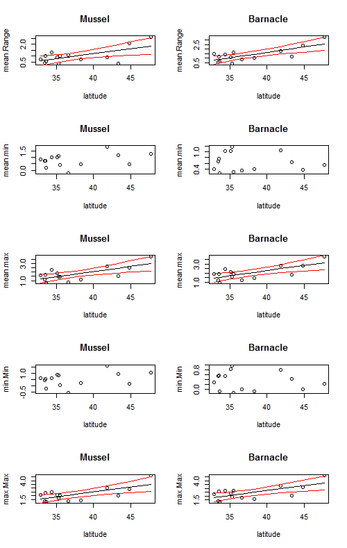
We can take it one step further and also loop over the different dependent variables (mean.Range, mean.min, mean.max, min.min, max.max) using a nest for loop.
First, we need to pull out the parameters that we are interested in.
# pull out the column names for the parameters that we care about

params<-colnames(Data.summary)[c(4,7,8,9,10)]
Now, let’s loop over both parameters and species.
par(mfrow=c(5,2)) # create a 5 x 2 subplot
for (j in 1:length(params)){ #loop over different parameters
  for (i in 1:length(sp)){ # loop over different species

    #linear model
    mod<-lm(Data.summary[,params[j]] ~ lat, data = Data.summary, subset= Data.summary$Species == sp[i])

    # print the results
    print(params[j])
    print(sp[i])
    print(summary(mod))

    # plot the raw data
    plot(Data.summary[Data.summary$Species == sp[i],"lat"],Data.summary[Data.summary$Species == sp[i],params[j]],
         xlab = 'latitude', ylab = params[j], main = sp[i])

	# create predicted data
	new.Y<-predict(mod, se = TRUE, interval = 'confidence') # fit, upper and lower CI

	# plot a trendline

      lines(Data.summary[Data.summary$Species == sp[i],"lat"], new.Y$fit[,1])
      # add lines for 95% confidence intervals
      lines(Data.summary[Data.summary$Species == sp[i],"lat"], new.Y$fit[,2], col = 'red')
      lines(Data.summary[Data.summary$Species == sp[i],"lat"], new.Y$fit[,3], col = 'red')


  }
}
This code creates a 5 x 2 figure with trendlines for every graph, but it is not correct to put a trendline on a relationship that is not statistically significant. So, let’s take it even one step further and use an if statement to only plot a trendline if the p-value is < = 0.05.
par(mfrow=c(5,2)) # create a 5 x 2 subplot
for (j in 1:length(params)){ #loop over different parameters
  for (i in 1:length(sp)){ # loop over different species

    #linear model
    mod<-lm(Data.summary[,params[j]] ~ lat, data = Data.summary, subset= Data.summary$Species == sp[i])

    # print the results
    print(params[j])
    print(sp[i])
    print(summary(mod))
    # plot the raw data
    plot(Data.summary[Data.summary$Species == sp[i],"lat"],Data.summary[Data.summary$Species == sp[i],params[j]],
         xlab = 'latitude', ylab = params[j], main = sp[i])
    # plot a trendline only if the p-value is less than 0.05

    if(anova(mod)$'Pr(>F)'[1]<=0.05){ # if the p-value is less than or equal to 0.05 then plot the lines
      #lines(Data.summary[Data.summary$Species == sp[i],"lat"],predict(mod))
      new.Y<-predict(mod, se = TRUE, interval = 'confidence') # fit, upper and lower CI
      lines(Data.summary[Data.summary$Species == sp[i],"lat"], new.Y$fit[,1])
      # add lines for 95% confidence intervals
      lines(Data.summary[Data.summary$Species == sp[i],"lat"], new.Y$fit[,2], col = 'red')
      lines(Data.summary[Data.summary$Species == sp[i],"lat"], new.Y$fit[,3], col = 'red')

    }
  }
}
The following code made this plot: