Data structure and simple plotting!
This post focuses on proper data structure and some basic plotting techniques.
Data structure
How you structure your data in excel is very important. Putting your data in a complicated structure can make coding very difficult. The best way to organize your data is by using a long format.
What does it mean to have a long format?
Lauren Pandori, a grad student in the Sorte Lab, supplied me with some of her data for this lesson. Let’s take a look at how she formatted it.
The first time that she sent me her data it was formatted like this:
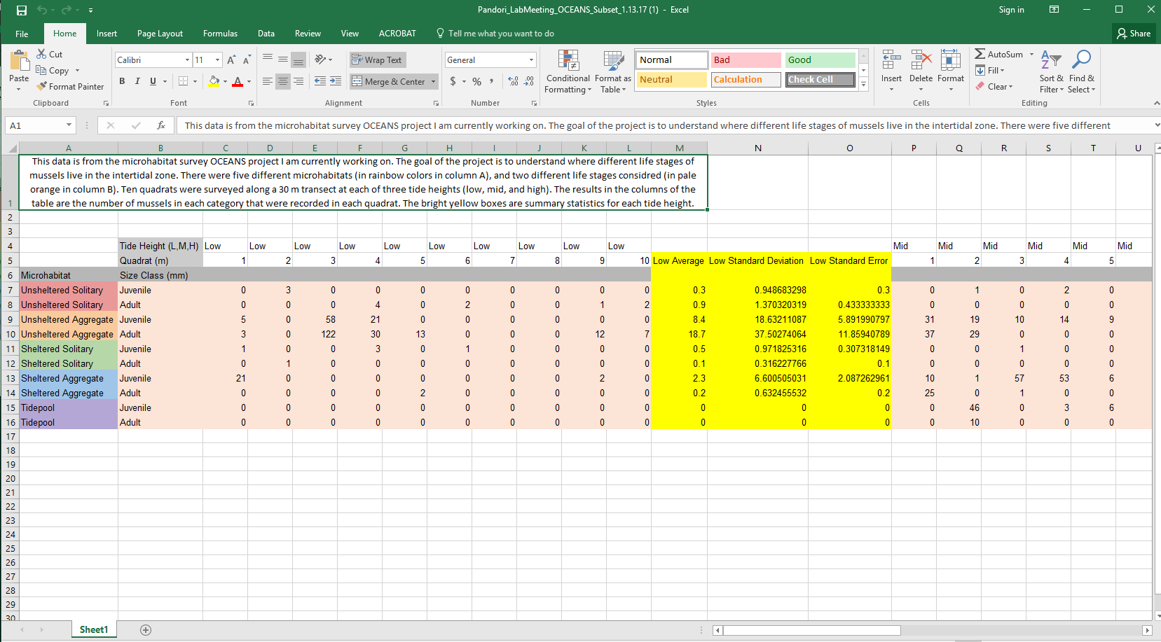
There are two issues with this formatting: 1) It is in short format. You can see that every quadrat has its own column. This is completely fine for analyzing data in excel, but it is not appropriate for R. 2) The names have spaces and non alphanumeric characters in them and they are long.
Here is an example of this same data, but formatted in a way that is much more amenable to R:
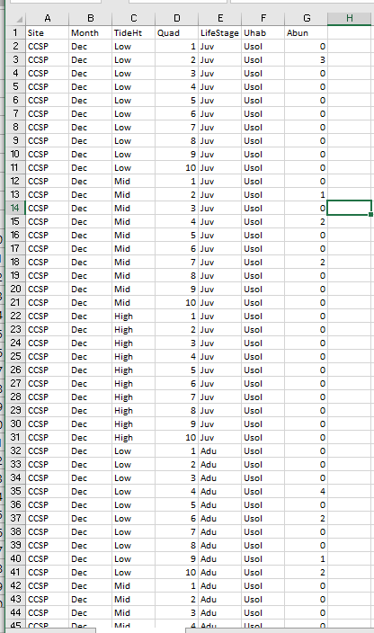
You can see now that every row is a unique data point with all the columns listing the different attributes of that data point.
Simple Plotting
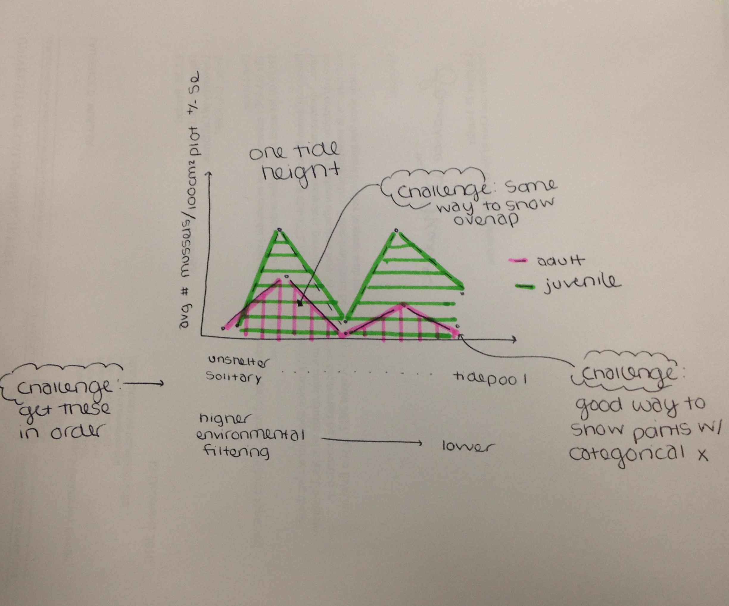
Today we are going to take Lauren’s data and make a simple plot. Lauren’s data set consists of mussel counts across 5 different microhabitat types (Tide pools, Unsheltered Solitary, Sheltered Aggregate, and Unsheltered Aggregate) in 3 different tidal zone (Low, Mid, High). She also has 10 replicate quadrats across each tidal zone and microhabitat type. When I asked Lauren how she wanted her data plotted she sent me this picture. :) So, this is what we are going to plot today!
Let’s code!
First, remember from last week how to properly structure your script. So, let’s follow our best practices
####################################################
# Script to create plot for Lauren's ocean project #
# Created by Nyssa
# created on 1/16/2017
####################################################

## clear workspace---------
rm(lists=ls())

## set working directory------
setwd(getwd())

# load libraries------------------
library(plyr) #need to summarize data

## Load Data-------------
Data<-read.csv('Data/PandoriData.csv')

## Data analysis-----------------
Before we start any data analysis it is always best to check your dataset and make sure that there are no errors. You can do this by using the head () and tail () function. This shows your the first 6 and last six rows of your data. Then you can see if there is anything weird and you can clean it
# clean the data--------------
# check the data
head(Data)
tail(Data)

## there seems to be an extra row, probably because something was deleted

#remove extra/unwanted column
Data$X<-NULL
Our data are now in a clean dataframe (the name of the data strucutre). You will notice that there are two different types of data in this dataframe. A factor and an integer. The factor are discrete data that have levels. For example, Tide height here is a factor with levels low, mid, and high. R automatically puts the levels in alphabetical order, but sometimes this does not make sense. For example, high should go after mid, not before. So now we are going to order the factors in a way that makes sense for Lauren’s data.
# order the habitat data by level of environmental filtering:
# 1. Unsheltered solitary (Usol), 2. Unsheltered aggregate (Uagg), 3. Sheltered solitary (Ssol),
# 4. Sheltered aggregate (Sagg), 5. Tidepool (Tide)

Data$Uhab <- ordered(Data$Uhab, levels = c("Usol", "Uagg", "Ssol","Sagg","Tide"))

# check that they are ordered the correct way
unique(Data$Uhab)

#Let's do the same for tide height
Data$TideHt<-ordered(Data$TideHt, levels = c("Low","Mid","High"))
Next, we want to take the averages by tide height, life stage, and habitat type to make the figure that she would like. We are going to have an entire lesson on different ways to summarize data so I am not going to go into detail on different ways to do this. I really like the ddply function from the plyr package so that is what I am going to use.
## take the averages by tide height, juve/adult, and habitat
Data.mean<-ddply(Data, c("TideHt","LifeStage","Uhab"), summarize,
                 Abun.Mean = mean(Abun, na.rm=TRUE), # this is saying to take the mean and ignore missing data if there is any
                 N = sum(!is.na(Abun)), # how many samples do you have (code says what is not a missing value and sum the counts)
                 Abund.SE = sd(Abun)/sqrt(N) # this is the standard erre
                 )

# check the data
Data.mean  #notice that it calculated the means and SE in the order that you specified above
# Low, then Mid, then High, and same for the order for Uhab
I now have a new dataframe with the averages and standard error values by each group that I am interested in visualizing.
Now let’s plot the data. First let’s create a barplot with just the low tide data. Because we have 2 different groupings (Tide height and also Life stage), we need to make the data a matrix with adults on top and juveniles on the bottom. The below code will put the first 5 data points (adults) in one column and then the second 5 in the second column and then I used t to transpose it so that there are 5 columns and 2 rows.
# I created a matrix for the mean and named it m
m<-t(matrix(Data.mean$Abun.Mean[Data.mean$TideHt=='Low'],5,2))
# a matrix for the SE and names it mse
mse<- t(matrix(Data.mean$Abund.SE[Data.mean$TideHt=='Low'],5,2))
Now let’s create a barplot with this data.
x<-barplot(m) # m is our mussel mean data
When we run this code we get a really simple plot below with all the defaults.
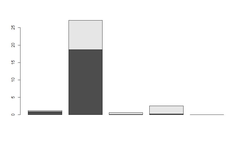
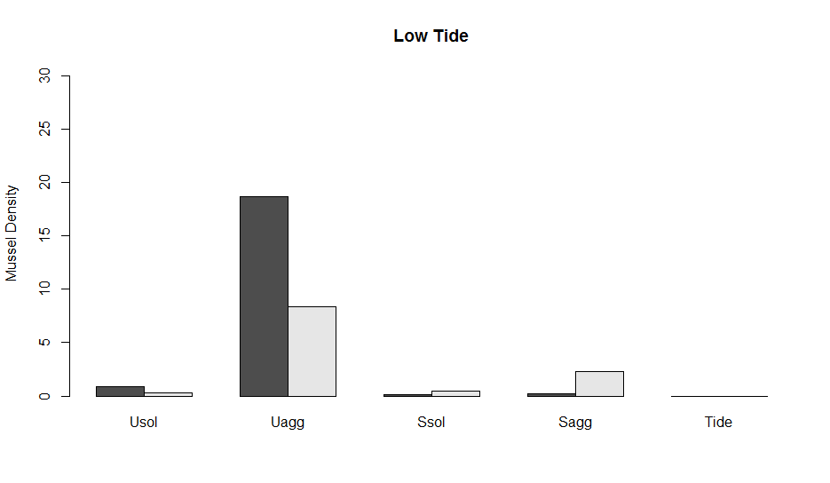
The default is to stack the data on top of each other. If this were % cover data it would be fine, but it is not so let’s put them next to each other using beside=TRUE. Also, let’s customize it a bit so that it is more informative. The names.arg says what we should name the x-axis. You can also manually put in names to make it prettier. I also set the y axes from 0 to the max abundance across + SE the entire data set and I gave it a title of Low tide and a y-label of mussel density. Look at ?barplot to find all the ways that you can manipulate a barplot.
x<-barplot(m, # m is our mussel mean data
        beside=TRUE, names.arg = unique(Data.mean$Uhab), ylim=c(0, max(Data.mean$Abun.Mean)+ max(Data.mean$Abund.SE)),
        main='Low Tide', ylab="Mussel Density")
This code will now create the plot below.
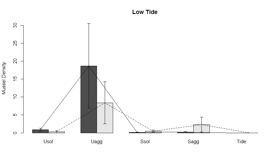
Now, let’s add error bars. One of the ways to make error bars in the base package is with the function arrows which essentially adds an arrow from point x to point y in whatever direction that you want. I named the barplot above x. You will notice that now x is a 2 x 5 matrix. These are the positions of the data (the bars in the figure) along the x-axis. The first row is the adult and the second are the Juveniles
# the code the add the arrows
arrows(x, m + mse,  # x , mean + SE
       x, m - mse,  # x, mean - SE
       angle=90, code=3, length = 0.05) # angle is 90 degrees (180 is horizontal), code is the time of arrowhead, and
# length is the length of the arrow head

Lauren also wanted lines connecting the different data points. To add another layer of lines to the plot we use the functions lines, like so:
lines(x[1,],m[1,]) # line for adults
lines(x[2,],m[2,], lty = 2) # line for juveniles
# I made this line type dashed to make it different from the first using lty=2
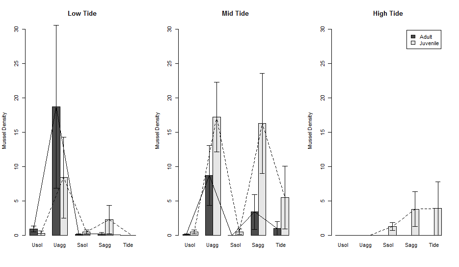
Now, let’s say that you want to compare the data across tide heights. We can make multiple subplots in one figure using the par() function. The par() function basically does all the different types of plot manipulating that you want, including changing margins, number of subplots, removing background, and many more. For subplotting we use par(mfrow=c(rows,columns)). Where you put the number of rows and columns you want in your plot. Here we have 3 tide heights so we are going to put in 1 row and 3 columns. Then we can copy and paste all the code above, but select data for the mid and high tide heights to make the graph. In a future lesson, I am going to show you how to do this with a for loop so that it is much more streamlined.
# let's make 3 columns and one row
par(mfrow=c(1,3))
#Low tide data
m<-t(matrix(Data.mean$Abun.Mean[Data.mean$TideHt=='Low'],5,2))
mse<- t(matrix(Data.mean$Abund.SE[Data.mean$TideHt=='Low'],5,2))
# plot
x<-barplot(m, # m is our mussel mean data
           beside=TRUE, names.arg = unique(Data.mean$Uhab), ylim=c(0, max(Data.mean$Abun.Mean)+ max(Data.mean$Abund.SE)),
           main='Low Tide', ylab="Mussel Density")
#error bars
arrows(x, m + mse,  # x , mean + SE
       x, m - mse,  # x, mean - SE
       angle=90, code=3, length = 0.05)
# lines
lines(x[1,],m[1,])
lines(x[2,],m[2,], lty = 2)

#Mid tide data
m<-t(matrix(Data.mean$Abun.Mean[Data.mean$TideHt=='Mid'],5,2))
mse<- t(matrix(Data.mean$Abund.SE[Data.mean$TideHt=='Mid'],5,2))
# plot
x<-barplot(m, # m is our mussel mean data
           beside=TRUE, names.arg = unique(Data.mean$Uhab), ylim=c(0, max(Data.mean$Abun.Mean)+ max(Data.mean$Abund.SE)),
           main='Mid Tide', ylab="Mussel Density")
#error bars
arrows(x, m + mse,  # x , mean + SE
       x, m - mse,  # x, mean - SE
       angle=90, code=3, length = 0.05)
# lines
lines(x[1,],m[1,])
lines(x[2,],m[2,], lty = 2)

#Hight tide data
m<-t(matrix(Data.mean$Abun.Mean[Data.mean$TideHt=='High'],5,2))
mse<- t(matrix(Data.mean$Abund.SE[Data.mean$TideHt=='High'],5,2))
# plot
# also in this last plot let's add a legend.  We can also manually add a legend outside of this code using the function legend()
x<-barplot(m, # m is our mussel mean data
           beside=TRUE, names.arg = unique(Data.mean$Uhab), ylim=c(0, max(Data.mean$Abun.Mean)+ max(Data.mean$Abund.SE)),
           main='High Tide', ylab="Mussel Density", legend.text = c('Adult','Juvenile'))
#error bars
arrows(x, m + mse,  # x , mean + SE
       x, m - mse,  # x, mean - SE
       angle=90, code=3, length = 0.05)
# lines
lines(x[1,],m[1,])
lines(x[2,],m[2,], lty = 2)
The plot now looks like this.
Saving the plot
Lastly, we want to save this plot with specific dimensions so that it comes out perfect every time we run it. You can save a plot in almost any format (e.g., pdf, png, jpg, etc.). Here, I will show you have to save a pdf file.
The code for saving a pdf file is pdf(file = “filename”, width = x, height = y), where width and height are in inches. Note, that now all formats save in inches. This line goes before your code for the figure that you are creating, then at the end of your figure you put dev.off(). Which says, turn off the graphics device and save the figure.
pdf(file = 'Output/LaurenBarChart.pdf', width = 8, height = 6) # name the file, put it in your output folder, then say how big you want it to be in inches.

 # now put all the code we just ran here
# and close it with

dev.off() # turn off the device and export the figure
So, all together now
pdf(file = 'Output/LaurenBarChart.pdf', width = 8, height = 6) # name the

# let's make 3 columns and one row
par(mfrow=c(1,3))
#Low tide data
m<-t(matrix(Data.mean$Abun.Mean[Data.mean$TideHt=='Low'],5,2))
mse<- t(matrix(Data.mean$Abund.SE[Data.mean$TideHt=='Low'],5,2))
# plot
x<-barplot(m, # m is our mussel mean data
           beside=TRUE, names.arg = unique(Data.mean$Uhab), ylim=c(0, max(Data.mean$Abun.Mean)+ max(Data.mean$Abund.SE)),
           main='Low Tide', ylab="Mussel Density")
#error bars
arrows(x, m + mse,  # x , mean + SE
       x, m - mse,  # x, mean - SE
       angle=90, code=3, length = 0.05)
# lines
lines(x[1,],m[1,])
lines(x[2,],m[2,], lty = 2)

#Mid tide data
m<-t(matrix(Data.mean$Abun.Mean[Data.mean$TideHt=='Mid'],5,2))
mse<- t(matrix(Data.mean$Abund.SE[Data.mean$TideHt=='Mid'],5,2))
# plot
x<-barplot(m, # m is our mussel mean data
           beside=TRUE, names.arg = unique(Data.mean$Uhab), ylim=c(0, max(Data.mean$Abun.Mean)+ max(Data.mean$Abund.SE)),
           main='Mid Tide', ylab="Mussel Density")
#error bars
arrows(x, m + mse,  # x , mean + SE
       x, m - mse,  # x, mean - SE
       angle=90, code=3, length = 0.05)
# lines
lines(x[1,],m[1,])
lines(x[2,],m[2,], lty = 2)

#Hight tide data
m<-t(matrix(Data.mean$Abun.Mean[Data.mean$TideHt=='High'],5,2))
mse<- t(matrix(Data.mean$Abund.SE[Data.mean$TideHt=='High'],5,2))
# plot
# also in this last plot let's add a legend.  We can also manually add a legend outside of this code using the function legend()
x<-barplot(m, # m is our mussel mean data
           beside=TRUE, names.arg = unique(Data.mean$Uhab), ylim=c(0, max(Data.mean$Abun.Mean)+ max(Data.mean$Abund.SE)),
           main='High Tide', ylab="Mussel Density", legend.text = c('Adult','Juvenile'))
#error bars
arrows(x, m + mse,  # x , mean + SE
       x, m - mse,  # x, mean - SE
       angle=90, code=3, length = 0.05)
# lines
lines(x[1,],m[1,])
lines(x[2,],m[2,], lty = 2)

dev.off() # turn off the device and export the figure
Now, your figure is saved in your output folder as a PDF!
OK, now your turn!